Lykkeway is a project by Catherine Maurin.
As psychotherapist in brief therapies,
she offers video and in-office sessions,
in particular based on the MOSAIC ®
method and clinical EFT.
This project together was deployed
in 4 parts:
visual identity, deployment on communication media, Instagram feed and website.
A soft and dynamic logo
A stable and dynamic text combined
with a line that evokes the link, the path
and the helping relationship.
The dragonfly borrows the symbolism
of the butterfly and water: life cycles,
transformation, the source of life
and the multitude of states.
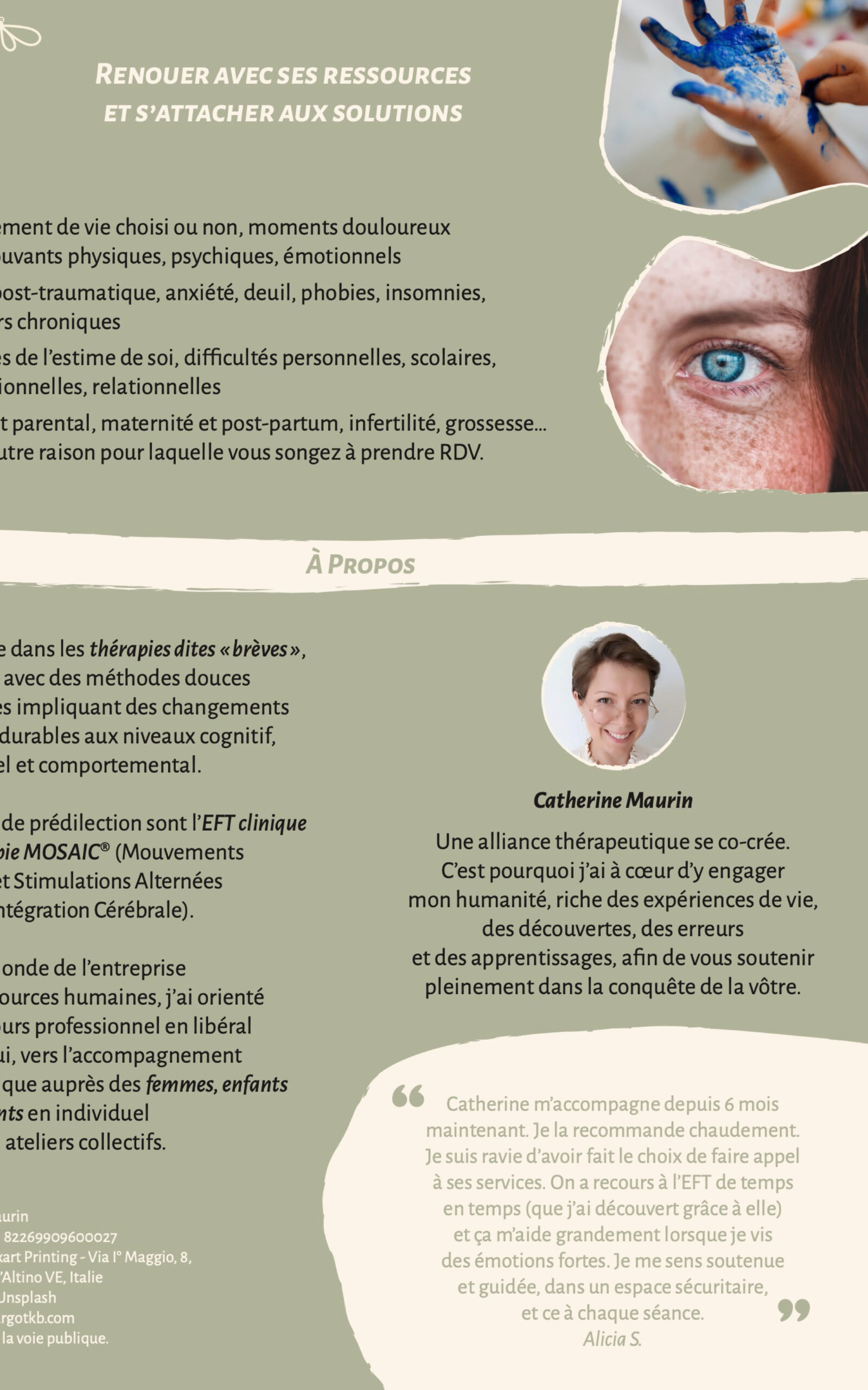
I declined this identity on various media: Flyer, business card, email signature, fee note, letterhead…
The visual identity has been declined
in posts, covers of reels, live and stories
to create a coherent and rhythmic whole.
Visuals designed for each type of content, highlighting each particularity while
maintaining softness and fluidity.
A complete and instinctive site
The visual identity was declined
on a 6 pages website to discover
Catherine’s therapy offer.
After the design work, I also worked
on the security and optimization
of the website as well as its inclusivity.
And of course, I adapted it for computer,
tablet and mobile navigation.
Lykkeway is a project by Catherine Maurin.
As psychotherapist in brief therapies,
she offers video and in-office sessions,
in particular based on the MOSAIC ®
method and clinical EFT.
This project together was deployed
in 4 parts:
visual identity, deployment on communication media, Instagram feed and website.
A soft and dynamic logo
A stable and dynamic text combined
with a line that evokes the link, the path
and the helping relationship.
The dragonfly borrows the symbolism
of the butterfly and water: life cycles,
transformation, the source of life
and the multitude of states.
I declined this identity on various media: Flyer, business card, email signature, fee note, letterhead…
The visual identity has been declined
in posts, covers of reels, live and stories
to create a coherent and rhythmic whole.
Visuals designed for each type of content, highlighting each particularity while
maintaining softness and fluidity.
A complete and instinctive site
The visual identity was declined
on a 6 pages website to discover
Catherine’s therapy offer.
After the design work, I also worked
on the security and optimization
of the website as well as its inclusivity.
And of course, I adapted it for computer,
tablet and mobile navigation.